

How to Design Custom Wedding Signs: A Step-by-Step Guide
Table of Contents
- Step 1: Plan Your Wedding Signage Layout and Placement
- Step 2: Choose Wedding Sign Wording and Templates
- Step 3: Pick Wedding Sign Sizes and Materials
- Step 4: Use Wedding Sign Design Apps to Build Your Layout
- Step 5: Set Up Print-Ready Files for DIY or Professional Production
- Step 6: Review Wedding Signage Examples for Typography and Readability
- Common Mistakes to Avoid When Designing Custom Wedding Signs
- Frequently Asked Questions
Last Updated: October 8, 2026
Step 1: Plan Your Wedding Signage Layout and Placement
Custom wedding signs work best when you plan the whole set before you design a single piece. Walk your venue first, list every spot a guest might need direction, then decide what goes where. That one planning session prevents the mismatched, last-minute scramble that ruins otherwise beautiful signage.
Most couples need five to eight signs. Here is the short list:
- Welcome sign at the entrance or ceremony start
- Seating chart or table plan near the reception
- Table numbers
- Bar and dessert menu signs
- Card and gift table sign
- Memorial or unplugged ceremony note
Placement matters more than quantity. Signs should sit at eye level, roughly 5 feet off the ground, and land in a guest's line of sight before they have to ask a question. A welcome board hidden behind a floral arch does nothing.
Measure each spot and note the surface: easel, wall, lawn stake, or tabletop. That detail decides your mounting later.
Step 2: Choose Wedding Sign Wording and Templates
Wedding sign wording and templates give you a starting point, but the words still have to sound like you. A welcome sign needs three things: a greeting, your names, and your wedding date. Everything else is optional.
Keep it short. Guests read signs in passing, not at length. Ten words or fewer per line works for almost every sign.
Popular phrasing patterns include:
- "Welcome to the wedding of [Name] & [Name]"
- "[Name] & [Name] | [Date] | [Venue]"
- "Please find your seat" for seating charts
- "Pick a seat, not a side" for open seating
Free template libraries exist, but watch for clunky placeholder text you forget to swap. We see this constantly: a couple orders a proof, approves it fast, and the sign prints with "[Your Names Here]" still on it.
Personal touches earn their space. A line in a family language, a private joke, or a favorite quote makes a sign feel like yours. Just keep the main message readable in one glance.
Step 3: Pick Wedding Sign Sizes and Materials
Wedding sign sizes and materials should match the viewing distance, the surface, and the weather.
Start with the viewing distance, then size the sign. The main line of text should be about 1 inch tall for every 10 feet of viewing distance, and the sign itself should be roughly 10 to 12 times the height of that main line. That gives you a working range:
| Sign Type | Typical Size | Viewing Distance | Best Material |
|---|---|---|---|
| Welcome sign | 18x24 in to 24x36 in | 10-15 ft | Wood, acrylic |
| Seating chart | 24x36 in to 30x40 in | 6-10 ft | Foam board, acrylic |
| Table numbers | 4x6 in to 5x7 in | 2-3 ft | Wood, card stock |
| Directional signs | 12x18 in | 8-12 ft | Foam board, wood |
| Bar or menu sign | 11x14 in to 16x20 in | 3-5 ft | Acrylic, foam board |
Placement drives size more than taste does. A welcome sign at a venue entrance is read from 10 to 15 feet as guests walk in, so 24x36 in is the safe floor.
Material trade-offs matter more than most couples expect:
- Wood brings warmth and suits rustic, farmhouse, and boho themes. It is heavy, so it needs a sturdy easel or a wall mount. Unfinished wood outdoors will gray and check over time; a spar urethane or exterior poly finish slows that down. A carved wood sign holds up for decades indoors.
- Acrylic gives a clean, modern look and handles outdoor weather well because it does not absorb water. It scratches, so transport it wrapped. Frosted acrylic reads better than clear acrylic in bright sun because it cuts glare.
- Foam board is light and cheap but dents easily and is not weatherproof. Use it for indoor seating charts and table numbers, not for an outdoor welcome sign.
- Mylar and vinyl are for stencils and decals, not for the sign body. Vinyl applied to painted wood can lift at the edges in heat.
Weatherproofing, transport, and reuse are decision factors, not afterthoughts. For outdoor signs, seal wood with an exterior-grade finish, use stainless or coated hardware so it does not rust-stain the sign, and weight the base so wind does not tip an easel.
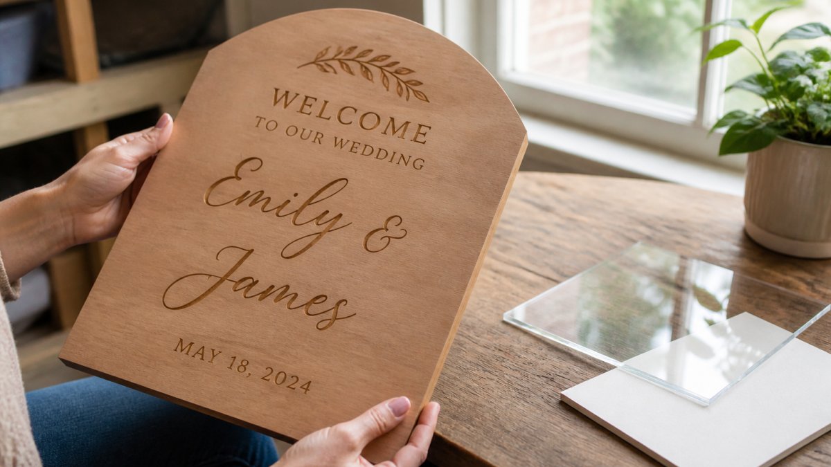
For a keepsake you will hang after the wedding, a carved wood sign holds up for decades. Our U.S. Forest Service wood products guide notes how finish and species affect how wood ages, which matters if you want the sign to last.
Step 4: Use Wedding Sign Design Apps to Build Your Layout
Wedding sign design apps let you build a layout without design training. Canva is the most common starting point, and Cricut Design Space handles cut files if you plan to make the sign yourself.
Start with a blank canvas at your final print size. Do not design at a small size and scale up, or your text will look soft and stretched.
Set your layout in this order:
Custom Designed engraved or 3d carved sign →
- Choose the sign dimensions
- Add your text and set the font
- Place any graphics or borders
- Check contrast between text and background
- Export a high-resolution file
Keep fonts to two per sign, one for the main line and one for details. More than two looks busy fast.
If you want a carved or laser-cut piece, you can skip the app entirely. Our custom designed engraved or 3D carved sign starts at $15.30, and you send us your ideas and we return a proof to approve before we cut anything.

Step 5: Set Up Print-Ready Files for DIY or Professional Production
Print-ready files save you money and reprints. A print shop or a cutting machine needs a clean file, and a messy one gets rejected or comes out wrong.
Set these before you export:
- Resolution at 300 DPI for anything printed
- Color mode set to CMYK for print, RGB only for screens
- Bleed of 0.125 in on every side
- Fonts outlined or embedded
- Vector files (SVG, PDF) for cutting machines
Vector files work better than bitmapped images for carving and cutting. Send us a logo or signature as a vector and it cuts clean. Send a low-resolution photo and the edges get rough.
DIY versus professional comes down to volume and finish. A few simple signs on a home printer are fine. A full set of matching wood and acrylic pieces is not a weekend project.
Step 6: Review Wedding Signage Examples for Typography and Readability
Wedding signage examples teach you more in ten minutes than any font guide, but only if you look at them with a checklist. The question is not "is this pretty?" It is "can a guest read this from where they will actually stand?"
Readability comes down to four things you can measure:
- Font size at distance. A common sign-making rule of thumb is about 1 inch of capital letter height for every 10 feet of viewing distance. A welcome sign read from 15 feet needs roughly 1.5-inch-tall capitals; a seating chart read from 8 feet needs about 0.8-inch capitals; a table number read from 3 feet needs about 0.3-inch capitals. If the main line is smaller than that, guests will lean in or give up.
- Contrast. Dark text on a light background, or light text on a dark background, always beats mid-tone on mid-tone. A useful target is a contrast ratio of at least 4.5:1 for body text and 3:1 for large text (Understanding Success Criterion 1.4.3: Contrast (Minimum) | WAI). You can check any color pair with a free contrast checker before you commit.
- Text hierarchy. One dominant line, one supporting line, one detail line. The names or the greeting should be the largest element; the date, venue, or instruction should be smaller; any decorative script should be smallest and used only for accents. If every line is the same size, nothing reads as the main message.
- Letter spacing and stroke weight. Script and calligraphy fonts need generous spacing or the letters run together at distance. Thin-stroke fonts disappear in bright sun and on glossy acrylic. A clean serif or sans-serif with medium or bold weight holds up best for practical details.
Font pairing follows the same logic. Keep it to two fonts per sign: one display font for the main line and one readable font for everything else.
Test before you commit, and test at the real distance. Print your design at full size on plain paper, tape it to a wall, and stand at the distance a guest will stand.
Proof the file line by line before production. Read every word out loud, check names and dates against the invitation, and confirm that no placeholder text like "[Your Names Here]" survived.
Common Mistakes to Avoid When Designing Custom Wedding Signs
The biggest sign mistakes are avoidable and expensive. Here are the ones we see most.
- Too much text. Long paragraphs never get read. Cut every line you can.
- Low contrast. Light text on a light background disappears outdoors.
- Wrong size for the space. A tiny welcome sign gets lost in a large entryway.
- No proof approval. Always read the proof line by line before production.
- Ignoring the weather. Outdoor signs need a finish that handles sun and rain.
- Mismatched styles. Pick one theme and repeat the fonts and colors across every sign.
A carved or printed sign that matches your theme and reads clearly does its job. A cheap one that no one can read does not.
Planning a full set of wedding signs is a lot to juggle, and mismatched pieces show up in every photo. At HM Print & Design LLC, we turn your ideas into matching, hand-crafted signage that fits your theme. Our CNC 3D carved signs, plasma metal cutting, and custom commercial printing cover everything from a welcome board to table numbers. Every order includes a proof for your approval before we produce it. Get started with HM Print & Design LLC and walk into your venue with signage you are proud to display.
Frequently Asked Questions
Can I create my own custom wedding signs?
Yes, you can design custom wedding signs yourself using free or low-cost tools. Start by choosing a template, then edit the wording, fonts, and colors to match your theme. For DIY production, you can print on foam board or use a Cricut with vinyl. For a more polished look, many couples send their design to a professional shop for carving, printing, or laser cutting. HM Print & Design LLC, for example, offers custom carved signs starting at $15.30 and provides a proof before production.
What is the best app for designing signs?
Canva is the most popular free option for wedding sign design apps, offering thousands of templates and drag-and-drop editing. If you plan to use a cutting machine like a Cricut, check that the app can export SVG files. Most apps let you resize designs to standard sign dimensions like 18x24 inches or 24x36 inches.
What should I write on a wedding welcome sign?
A wedding welcome sign typically includes your names, the wedding date, and a short greeting like 'Welcome to our wedding' or 'Please find your seat.' You can also add a thank-you message or a quote. For wording and templates, keep it brief and readable from a distance. If you have a seating chart, direct guests to it. Personalized details such as your venue name or a hashtag are optional. Always order a proof to check spelling and layout before final production.
How do I choose the right material and size for a wedding sign?
For sizes, a welcome sign is usually 18x24 inches or 24x36 inches, while a seating chart may need 24x36 inches or larger. Materials range from wood and acrylic to foam board and mylar. Wood and acrylic are durable and weather-resistant for outdoor use; foam board is budget-friendly but best for indoor, temporary display. If you want a handcrafted look, CNC-carved wood signs offer depth and longevity. HM Print & Design LLC offers custom carved signs up to 30x30 inches in one piece.